BearBandMan wrote:
Okay, I just gotta say this: I hate our font.
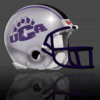
You know, that scraggly, scribbled typeset that I
guess is supposed to evoke the image of a bear's claws marks, but to me just looks like it was scratched out by a 1st grader.
For a reference example, see the side of the guy's football helmets.
Rationale: the font just doesn't look dignified to me. The collegiate style that I have noticed in many places emphasizes the block lettering, though with local influenced added. You just expect a college to have it's typeset look a certain way, and to me ours just doesn't work. I hate to say it, but it looks sort of high school-ish.
Maybe it's time to consider a helment redesign? A new font, please Lu! And, I may get the chair for this, but I think we need a logo redesign. The Kentucky Wildcat knock-off just isn't kosher anymore now that we're running with the big boys. I mean, we may even play them!
One request: let's not do a "running bear" redesign, okay?


Great points BBM!
I would like for our athletics to move in the direction of simply going by Central Arkansas. It would look better on our uniforms and memorabilia. If you read most articles and polls we are referred to as Central Arkansas and will continue to do so.
Our baseball team use to use just the CA logo on our uniforms and then went back to the UCA just recently. I think the old baseball logo would look cool on all of our athletic uniforms. It looked almost identical to the Augustana College logo. Just think how cool our football team would look if this helmet was
Purple and Gray!

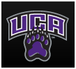
I would also like to go a different direction from the current Bear logo. We need a design that is much easier to produce. The current bear is too cartoon like and is harder to produce.
I like the Icon style images. Very simple one or two color designs. Here are some examples of what I am talking about if we used a bear of course.


Now compare ours to the above.